

Masonry Layout is a beautiful way to display columns with a different height by removing extra spaces between rows.
The standard 4-column grid layout is something that can easily be achieved with css flexbox or css grid. It looks something like this:
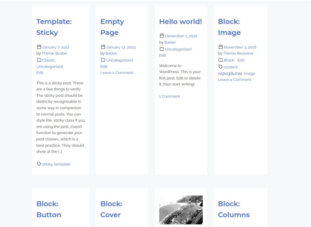
Standard 4-column Grid Layout with CSS Flexbox
While there is nothing wrong with this approach, as we see in the above image, if we have dynamic content, it might create huge gaps. There are a few ways to battle the extra space – by restricting the number of words or by making the columns equal in height.
In this tutorial, I will show you a different approach. It is called masonry layout. It is widely used for image galleries since most of the times images cannot be restricted the way text can. If we took the same example from above, the grid would look something like this:
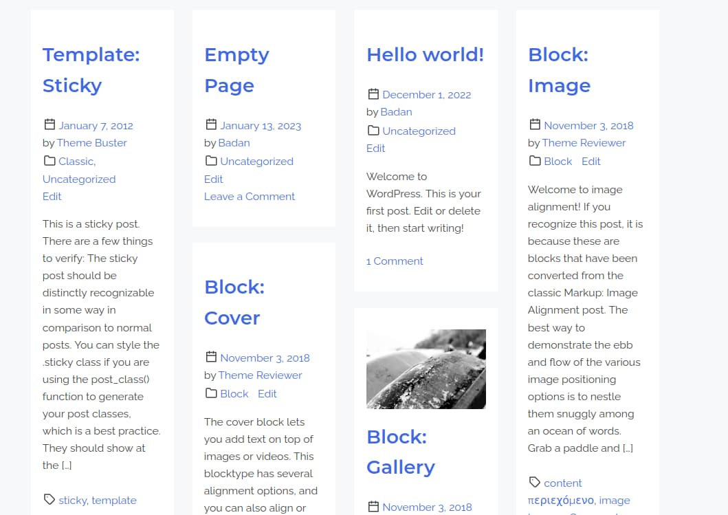
4-column Masonry Layout
As it is shown in the image, the huge spaces are now gracefully handled. There are a lot of tutorials on the internet on how to create a masonry layout, but they either recommend using expensive third-party javascript libraries with a lot of unnecessary code or they claim you can achieve the masonry effect with pure css. (no javascript) While you can technically achieve a masonry layout without js, there are a few important constraints that prevent it from working all the time! The first css-only technique uses css grid and works by targeting the different child elements. While this may work with static content, if you do not know the number of elements in the grid, you will not have much luck with it. There is also a way to create a masonry layout with css grids or flexbox but it reorders the position of the elements. While this might work for image galleries where image order is not so important, in a situation where we want to display the latest posts in a masonry layout, this approach won’t get us anywhere. Oh, and to give it justice, there is a new experimental property in Firefox “that finally makes things work… except for the fact that it is still not adopted in any major browsers except for Firefox and you need to enable the browser’s experimental features to actually see it in action. All of this info implies that currently we are stuck with using js to achieve masonry layout. Almost all tutorials on the internet advise you to use libraries to achieve masonry layout. However, this is not necessary, as you can also achieve a beautiful masonry layout with just a few lines of Javascript. Here is how to do it:

Create a Masonry Layout with CSS and Vanilla JS
The HTML Markup
<div class="post-container">
   <div class="post-inner">
      <!--You Need a List of Articles Here-->
      <article class="post hentry">
         Article One
      </article>
   </div>
</div>
We will use the above html markup. You are free to use any classes you want, but it is important that the masonry elements are wrapped in a container. (in our case it is a div with class "post-inner") We also need to have an additional wrapper to make it work. (here it is called "post-container" )
CSS
Our css code allows for multi-column layout:
@media (min-width: 54rem) {

	.masonry-layout {
		box-sizing: border-box;
		--columns: 1;
		--gap: 2rem;
		display: grid;
		grid-template-columns: repeat(var(--columns), 1fr);
		grid-gap: var(--gap);
		padding: 2rem;
	}

	.masonry-layout > div > img,
	.masonry-layout > div > div {
		width: 100%;
		margin-bottom: 2rem;
	}

	.masonry-layout.columns-1 {
		--columns: 1;
	}

	.masonry-layout.columns-2 {
		--columns: 2;
	}

	.masonry-layout.columns-3 {
		--columns: 3;
	}

	.masonry-layout.columns-4 {
		--columns: 4;
	}
}
Do not change any of the css here, the js code that we are going to add now will need it to work.
JS
Here is the js code that we are going to use.
const fecthMasonry = function( container, items, columns ) {
	const containerElement = document.getElementsByClassName( container )[ 0 ] || '';
	if ( ! containerElement ) {
		return;
	}
	const wrapperElement = containerElement.parentNode;
	const masonryElements = document.querySelectorAll( '.' + items );
	containerElement.parentNode.removeChild( containerElement );
	const newElement = document.createElement( 'div' );
	newElement.setAttribute( 'id', container );
	newElement.classList.add( 'masonry-layout', 'columns-' + columns );
	wrapperElement.appendChild( newElement );
	let countColumn = 1;
	for ( let i = 1; i <= columns; i++ ) {
		const newColumn = document.createElement( 'div' );
		newColumn.classList.add( 'masonry-column-' + i );
		newElement.appendChild( newColumn );
	}
	for ( let i = 0; i < masonryElements.length; i++ ) {
		const col = document.querySelector( '#' + container + ' > .masonry-column-' + countColumn );
		col.appendChild( masonryElements[ i ] );
		countColumn = countColumn < columns ? countColumn + 1 : 1;
	}
};
/* Pass data to generate masonry layout */
fecthMasonry( 'framework-post-inner', 'post', 4 );
The function fetchMasonry is a helper function that fetches the data it needs to create the masonry layout. It is where the magic happens, and you are not supposed to touch anything there. The final line in the code is where you give instructions on which DOM elements to display in a masonry layout. We are passing three parameters here. The first one is the class name of the parent element. In our case, it is framework-post-inner. The second parameter is the class of the elements inside the masonry. The final parameter is how many columns you would like to have. You can choose between 2-4.
That is all! If you like this post, please share it, and good luck with your next project!
Source: Masonry Layout JS Vanilla