
Video Guide One: Preslav Theme Options
Video Guide Two: Preslav Button Styles and Animations
Video Guide Three: How to Import Demo Content
Frequently Asked Questions
The theme options are located in the WordPress dashboard => appearance => customize.
Yes, if you haven’t added any content yet, you can go Appearance => Customize and you will load the starter content. If you have already added posts or pages, you can use the block patterns that are included in this theme. In this way, you can quickly construct the pages and customize accordingly.
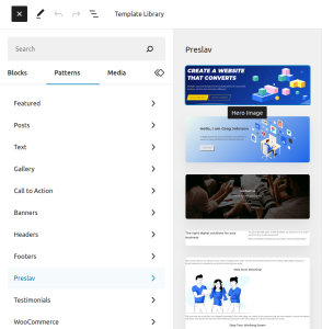
It is very easy, the header is a registered as a block pattern in the category “Preslav”. In the WordPress admin, edit a page, open the “Patterns” tab from the plus icon in to top left corner of the screen and click on the “Preslav” dropdown. From the list of patterns, select the first one (hero image).
To make the site title and the primary menu transparent like in the the theme screenshot, go to appearance, customize and choose the “Header Options” customizer panel. From there, go to the “Site Header” dropdown and add a tick to the “Enable Transparent Header on homepage” checkbox. To enable this option for other pages, you need to upgrade to the premium version of the theme.
Yes, it does! In fact, the free version has 10 patterns and the premium even more! Create a new page, by going to pages, add new, then click on the plus icon in the top left corner of the Block editor. Select the “Patterns” tab and click on the Preslav dropdown. From there, feel free to insert any pattern you like and customize accordingly.
Of course! You can change the default theme colors by going to the theme options at appearance, customize and pick the colors you want.
If you want to change the color of specific element, you can do that directly from the WordPress block editor.
This theme follows the WordPress coding conventions and uses core functions so that it can work with any plugin. While we cannot guarantee 100% compatibility with all plugins, the theme has been tested with the most popular ones, including the ones mentioned above and should work just fine, provided that the plugins are also well written and follow the best development practicies as well.
You can choose between three different header presets and change the header by going to appearance, customize, site header and select “right site title and logo” from the “Header Presets” dropdown.
It is easy! Go to the Gutenberg editor select the button you would like to customize and on the right side of the screen, you will see the settings for the specific block. Select the “styles” tab and change the button styles to taste.
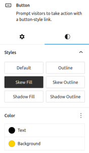
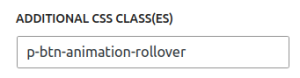
To change button hover animation, expand the Advanced section (go back to the settings tab) and add or remove the animation class. You can pick between 7 different hover animations thanks to the following classes:
- p-btn-animation-rollover
- p-btn-animation-border-move
- p-btn-animation-slide-in
- p-btn-animation-pulse
- p-btn-animation-shadow
- p-btn-animation-shadow–outline
- p-btn-animation-border
To change the scroll animation when the section is shown in the viewport, select the section in the Gutenberg editor (usually the group block), expand the Advanced section in the right sidebar (settings tab) and add or remove the animation class.
You can choose between the following animation classes:
- p-animation-text-transform (rotates the text from down to up)
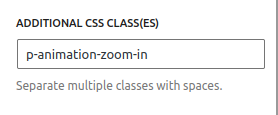
- p-animation-zoom-in (expands the section)
- p-animation-down-up (moves the first column down and the second up)
These classes work when you add them to group or cover Gutenberg blocks.
There are also headings and texts animations that you can use:
- p-animation-scale-change (expands the text)
- p-typewrite-animation (adds typewrite effect)
- p-animation-moveDown (moves the text down)
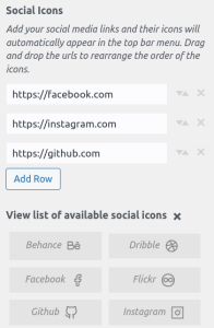
It is very easy! Go to appearance, customize and select the header options panel. After that, go to the Top Bar dropdown and customize accordingly. To add social icons, you need to insert your social media link in the Social Icons setting. You can reorder the social icons any way you want. For a full list of supported icons, expand the “View list of available social icons” dropdown.
Preslav follows the best WordPress practicies and does not reinvent the wheel. This means, all functionalities from the WordPress core are fully supported. You add a page, menu or a logo like you would do in any WordPress website. If you need general help with WordPress, I recommend you to read some articles in Wp Beginner or find some other nice tutorials.
How to create a menu in WordPress
How to add custom logo in WordPress
In addition to what WordPress cms can offer, Preslav theme gives you the flexibility to add a light version of the logo that will be displayed when the header is in transparent mode or when a dark theme mode has been selected.
Most of the pages in the theme demos use a custom page template, called Empty page. To change the page template, while editing a page, open the settings sidebar (click on settings icon on the right side of the screen) and expand the summary tab. Finally, click on “Default template” link and select the “Empty Page” template.
The empty page template ensures that everything from the page is created with the Gutenberg Editor. The standard page template displays site title and featured image if present. It is great for getting things started but lacks flexibility.
Sure thing! You can build beautiful pages with the free theme and with the help of the free block patterns but if you upgrade to the pro version, you will be able to install any theme demo with a single click.
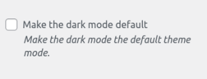
This feature is available in the premium version of the theme. All you need to do is to go to appearance, customize and select “Night mode” customizer section. Select the checkbox “Make the dark mode default” and press publish.
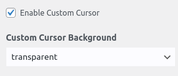
This feature is available in the premium version of the theme. All you need to do is to go to appearance, customize and select “General settings” customizer section. Select the checkbox “Enable Custom Cursor” and press publish.
Yes, we can do that for you. Please check the pricing plans of the theme.
Installation
To be able to use the theme, you need to have a self-hosted WordPress installation, running php >= 5.6 and WordPress >=6.0. It is recommended that you use php 7.4 or above and the latest version of WordPress.
- In your admin panel, go to Appearance -> Themes and click the ‘Add New’ button.
- Type in Preslav in the search form and press the ‘Enter’ key on your keyboard. If you have purchased the pro version, you need to upload the .zip file provided by email. Go to Appearance -> Themes -> Add New and then click “Upload Theme” button to install the Preslav Pro theme.
- Click on the ‘Activate’ button to use your new theme right away. If you have purchased the pro version, you need to activate Preslav Pro theme. You would also need to add the license key, which you have received by email.
- Navigate to Appearance > Customize in your admin panel and customize to taste.
Theme options
Use the theme customizer to customize the theme to taste. There are plenty of options to make your site unique. You can change theme accent colors, the header text color, the headings text color, the links text color and much more.
The theme options are located in the theme customizer. You can configure them by going to your WordPress dashboard => Appearance => customize. You can also access the customizer directly from the admin bar on the top of the page. Now, let’s have a look at the theme options in more detail.
Site identity
- Upload logo – you have the option to upload custom logo that will display in the site’s header.
- Change Site Title & Tagline – you have the option to add a site’s name and description
- Light logo – you have the option to upload custom light version of the logo that will be displayed on pages with transparent header and in the dark mode. If you do not upload a light logo, the default one will be used instead.
- Logo Width – Change the size of the logo (between 40 and 240px)
- Site Icon – you have the option to change the site icon in the browser tab (the tab icon at the top part of your browser) Colors Change the colors of the light theme such as the header, the headings, the links, the buttons and the menu text items. Control primary and secondary accent colors, as well as the header image gradient overlay colors.
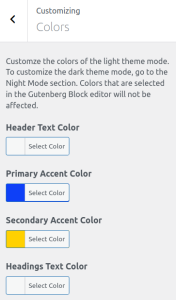
Colors
Customze the default colors of the light theme mode. You can always override those with the WordPress Block editor (Gutenberg).
- Header Text Color – change the color of the site title and description in the site header
- Primary Accent Color – controls the colors of the loading spinner, the mobile menu background, the features pattern and others.
- Secondary Accent Color – controls button background colors (if not set), the back to top button, page navigation background colors, progress bar and others
- Header Image Gradient Color One – change the color of the header image gradient on the left hand side of the screen
- Header Image Gradient Color Two – change the color of the header image gradient on the right hand side of the screen
- Headings Text Color – change the color of the headings (h1 to h6 html tags)
- Body Text Color – change the default text color
- Links Text Color – change the links color
- Buttons text color – change default button text color
- Buttons background color – change default button background color
- Primary Menu Text Color – change site menu’s text color
- Top Bar Background Color – Change the background color of the secondary menu, located at the top of the page
- Top Bar Text Color – Change the color of the menu items in the secondary menu, e.g. the location and mail icons and text, the social icons, etc.
Header Image
Preslav supports the option to add custom header image via the theme customizer. Go to Appearance > Customize > Header Image and upload a header image from your PC. The recommended image size is 1920X1080px. You have the options to crop the image (top, bottom or center) or to use the whole image (i recommend this). As a general recommendation, I would suggest to always compress the images that you upload, otherwise the site performace may deteriorate with time. Read more about that here.
When the header image is set, additional customization options for the header image will appear in the Header Image section:
- Header image background position – Vertically align the image (top, center, bottom). Default is top.
- Header image Gradient density – Control the gradient density. From 0 to 9. Default is 6. You can set it to 0 to completely remove it.
- Header Title – Change the default text of the header title.
- Header Description – Change the default text of the header description.
- Button text – Change the text of the button.
- Button Link – Add a link to the button. You can link it to the About page or the Contact page or to a specific section from the Homepage.
Widgets
Widgets are something very useful if you want to display dynamic info such as latest posts, latest comments or post archives on the website. Preslav theme supports 4 widget areas in the site footer. They all form a beautiful, evenly displayed 4-column layout.
Menus
This theme supports two menu location – The Primary menu and the Top menu (referred also in this documentation as the Top bar or the Secondary Menu)
- Primary Menu – You can create the primary menu from the theme customizer or you can also go to dashboard > menu. Click on create menu and give it a name, then drag or add the pages you want to it. After that, from the menu locations section, select Primary Menu checkbox. This theme supports as many sub-menus as you want.
- Top menu – You can create a top menu and it will appear in the Top Bar (the top most part of the header, where the search icon and the social icons are displayed) This menu should not be used as a primary menu, as It plays a secondary role, only create it if the primary menu is not enough for you! Create the menu, give it a name, then drag or add the pages you want to it. After that, from the menu locations section, select the Top Menu checkbox. This menu also supports sub-menus, just make sure it is not too much.
Mega Menu
Create a mega menu by adding “.mega-menu” class to a menu item that has submenus. Useful for very long dropdowns with two-level submenus.
Homepage Settings
Optionally specify a static front page.
Header Options
The header options tab in the theme customizer consists of two sections:
- site header
- top bar
Site Header Options
Customize the way the site header is displayed (site title, site description and primary menu)
- Header Presets – Reorder the way header items (site title, site description, logo and primary menu) are displayed
- Header Position – Customize the header position. Show it only on top of the page (static position), show it, while scrolling down (fixed) or show it when you scroll up (sticky). The default positon is sticky.
- Enable Transparent Header – the site title and the site menu will become transparent for the list of pages you specify
- Site Header Text Alignment – Horizontally align the header items. You can choose between, normal, center and space-between.
- Enable Current Menu Item Underline – detect the current page and add an underline to its menu item if it is present in the site menu
- Menu Item Hover Animation – Choose what happens when you hover over a menu item. You can choose between rollover and underline.
Top Bar options
The top bar is the top most part of the screen where location, phone, e-mail and search icons are displayed by default but you can customize accordingly. You can add social icons, e-commerce icons and even a menu!
- Enable Top Menu – show the top menu or remove it completely
- Top Bar Text Alignment – horizontally align the menu items (left, center, right)
- Address – add the physical address of your business
- Phone number – add phone number
- E-mail address – add email
- Show Search Icon – choose whether to display a search icon that performs a text search throughout the site
- Social Icons – choose between a list of social icons to display. You can choose between Behance, Dribble, Facebook,Flickr, Github, Instagram, Linkedin, Pinterest, Snapchat, Soundcloud, Tiktok, Tumblr, Twitch, Twitter, Youtube and more.
- Show Social icons on mobile – In mobile, the menu can get cluttered, since two two menus get combined into one for better user experience. That is why, the social icons are not displayed on mobile by default, However, you can choose to display them with this option.
Page Layout
You can control the desktop width of the page wrapper, post wrapper, the header and the footer.
General Settings
Customize the way the website is displayed. Show Back to Top Button Enable Page Loader on Homepage. Show a loading spinner while the page is loaded. Enable custom cursor.
Blog Settings
Choose what type of post information to show in the post archives or individual blog posts. The post meta information includes published date, author, category tags or comments. You can display or remove this information if you want.
- Toggle Post Meta Before Post Content – You can choose to show or hide the post meta before the post content. Drag and drop the boxes to chage the post meta order.
- Toggle Post Meta After Post Content – You can choose to show or hide the post meta after the post content. Drag and drop the boxes to chage the post meta order.
- Blog Excerpts – Show post excerpts instead of full content for your post archives.
- Post Excerpt Length – Enter a number between 10 and 55. Default is 55.
- Post Content Wrap – Wrap posts in a card or leave them as plain text.
- Post Archives Layout – Display posts in post archives in a single or multi-column layout
- Post Loop Animation – Animate blog posts in post archives.
- Post Archives Title Hover Animation – Choose an animation to display when hovering over a menu item.
- Enable Progress Bar – Show post progress when you scroll down the blog post.
Night Mode
Protect your visitors’ eyes and help them spend more time on your website by allowing them to switch between day and night mode (light and dark layout). To change to dark mode, you just need to click on the toggle button in the theme header. You can change the background color and add custom css to further customize the colors of the night mode. For example, if you want to change the link colors, you can use the following css (add it in the additional css tab):
body.dark-mode a {
    color: rgba(102, 222, 209, .8) !important;
}
There is more, you also have the option to switch default modes and display the dark layout by default. If you want, you can also disable the dark mode switch completely – it is completely up to you!
Footer Options
Change footer text color, footer background color, links and edit footer credits.
Additional CSS
This section is for more advanced users who want to write custom css to override the default theme’s styles.